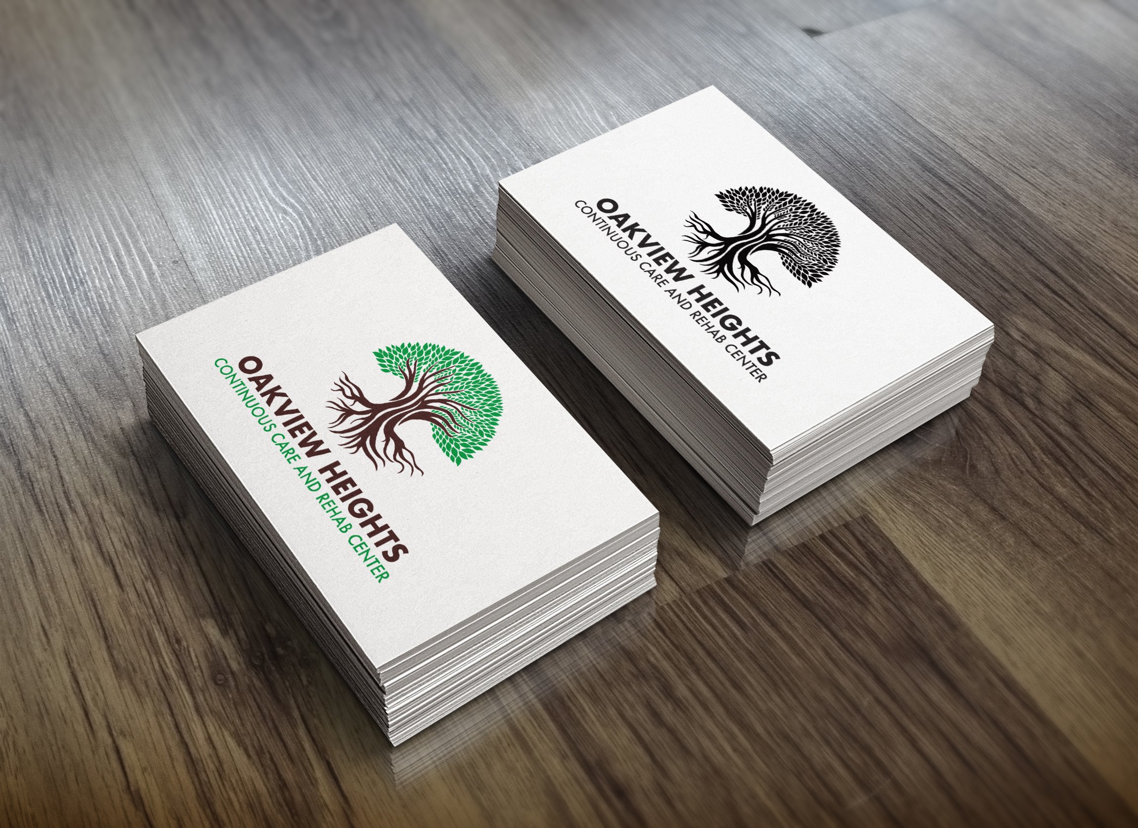
Oakview Heights Continuous Care & Rehab
OVERVIEW
I had the pleasure of working with Oakview Heights Continuous Care and. Rehab Center. I was asked to develop a new branding solution for the facility, provide variations that could be used as an icon and provide examples of potential product placement. I always enjoy the opportunity to utilize hand drawn concepts to give a customers branding a unique result.
OBJECTIVES
Design an illustrated logo that can be applied to a variety of applications.
Deliver a finished logo and placement mockups to present to leadership team.
PRocess
After discussing with the client to understand their needs and vision for the rebranded logo, we concluded that an illustrated logo would be the best direction. The client wanted the logo to emphasize the natural root and branch systems of the tree element in the logo to signify the network of care their establishment offers. The logo design process started with several compositions of sketches to hone in on the desired look before taking the illustration to digital vector artwork. Once digital, an initial layout was presented and then refined for the final logo.


